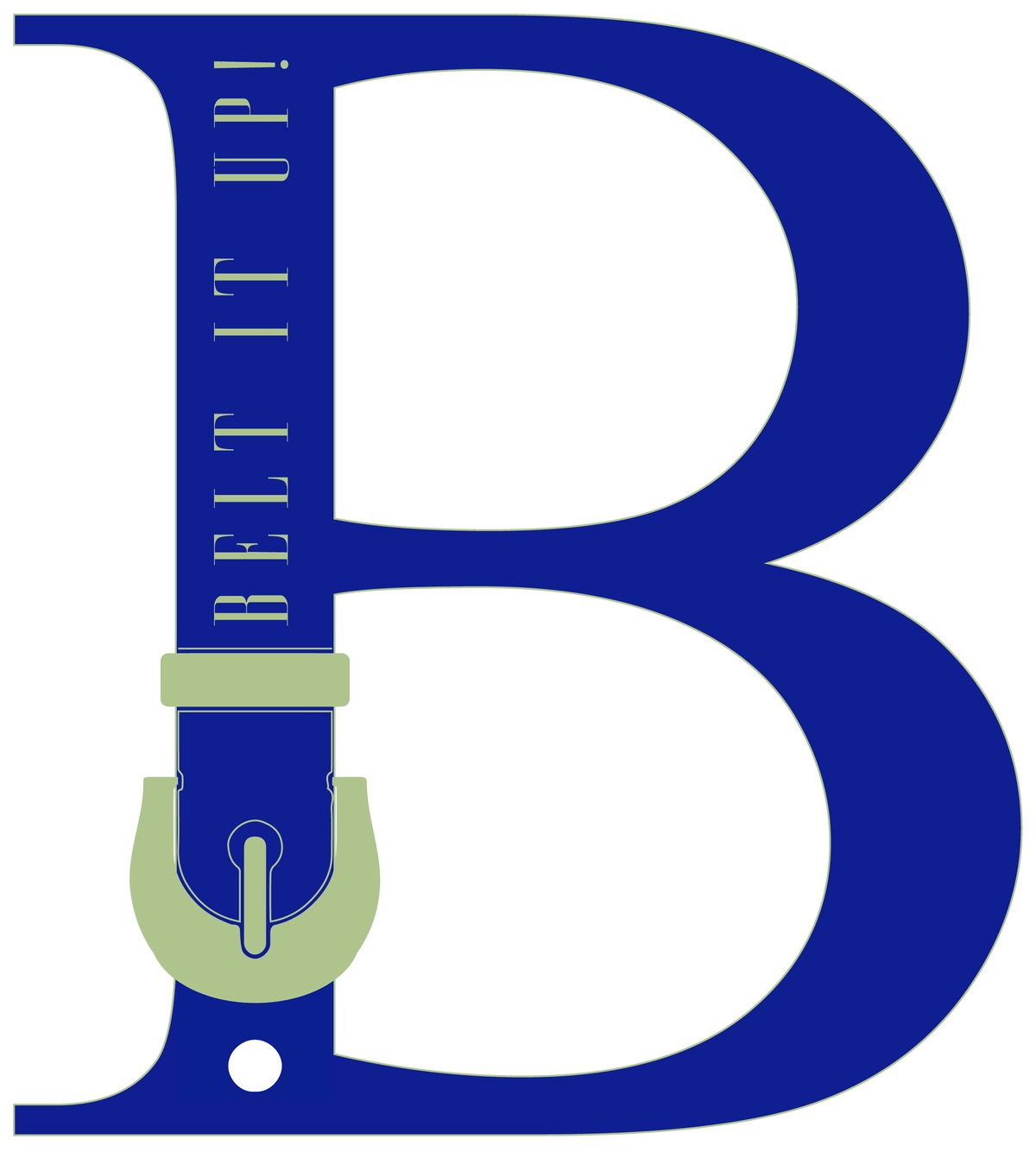
A logo identity for Belt It Up — a belt and accessories brand. The whole mark is one idea, told in a single letter: a "B" cinched by its own belt, buckle and all.
The best small-brand logos say the whole thing in a single move. For Belt It Up, that move is obvious in hindsight and easy to miss until you see it: the stem of the "B" becomes a fastened belt, complete with a metal buckle at its base.
It names the product, carries a wink, and works at any size — from a website header down to a stamped leather tag.
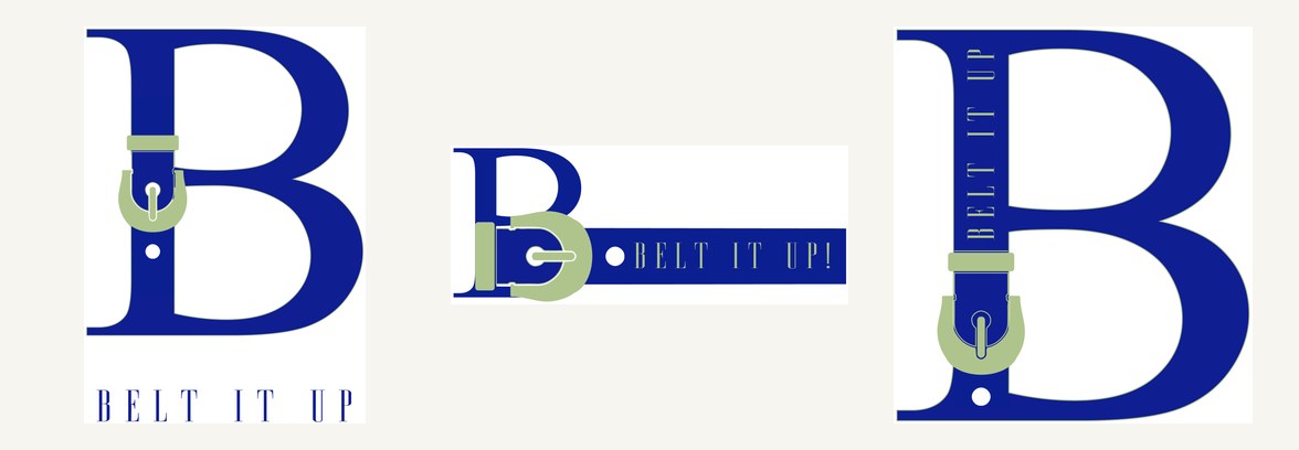
Make the letter do the work.
Rather than draw a belt next to a "B", the belt is the "B" — its vertical stroke threaded through a buckle so the counter of the letter reads as the loop. Routes explored the wordmark horizontally and stacked, but the strongest answer kept it as a single tall capital: a logo and a product shot at once.